BK Worm
UX Research, UX/UI Design, Branding
Research shows that student participation and engagement has plummeted nationwide as a result of remote learning.
BK Worm is a mobile educational platform for accessing children’s eBooks and developing literacy skills. Designed to be used in classrooms or at home, BK Worm integrates an extensive eBook library, assignments, and activity tracking to help keep parents and teachers updated on their child’s progress.
The app was designed and implemented as a part of a software engineering course. With design occurring parallel to development, the process took place over four sprints throughout a 12-week period, totaling about 108 hours.
Role
As the sole designer on the team, I was responsible for UX research, wireframes, mockups, prototypes, creative assets, and branding.
With UX design and development happening simultaneously, I had to work quickly to conduct and analyze research, create graphics, and deliver prototypes for the software team to implement. I collaborated with the project lead to hold user interviews, brainstorm potential solutions, and present client updates.
Product Definition
Originally pitched as a subscription-based platform for streaming eBooks, BK Worm’s focus shifted towards children’s books and education after researching opportunities in the market.
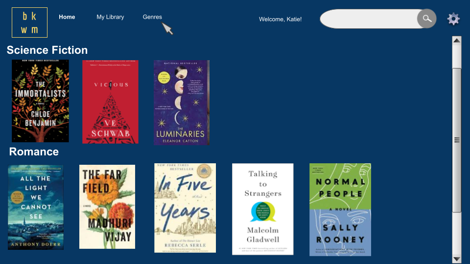
“bkworm is an industry-disrupting streaming platform that offers a wide variety of eBooks on an iOS app. As long as you’re connected to the internet, you can read any of the books, anytime and anywhere. You’ll be able to highlight and bookmark pages as you read, along with other features.”
The clients provided a feature list, an outline of the backend, and conceptual UI mockups to help us get started. Our goal as a team was to create the first version of BK Worm, which would lay the groundwork for future development of the app.
However, preliminary market research revealed that services like Kindle Unlimited and Prime Reading already existed as strong competitors to BK Worm. As a result, the team decided to scope out possible market niches and chose to focus on children’s eBooks and literacy skills. This shifted our attention to children, parents, and educators as our target audiences.
Research
I helped conduct four interviews with educators to get a better sense of how BK Worm could be adapted for classroom use and looked at best practices and advice for designing children’s interfaces.
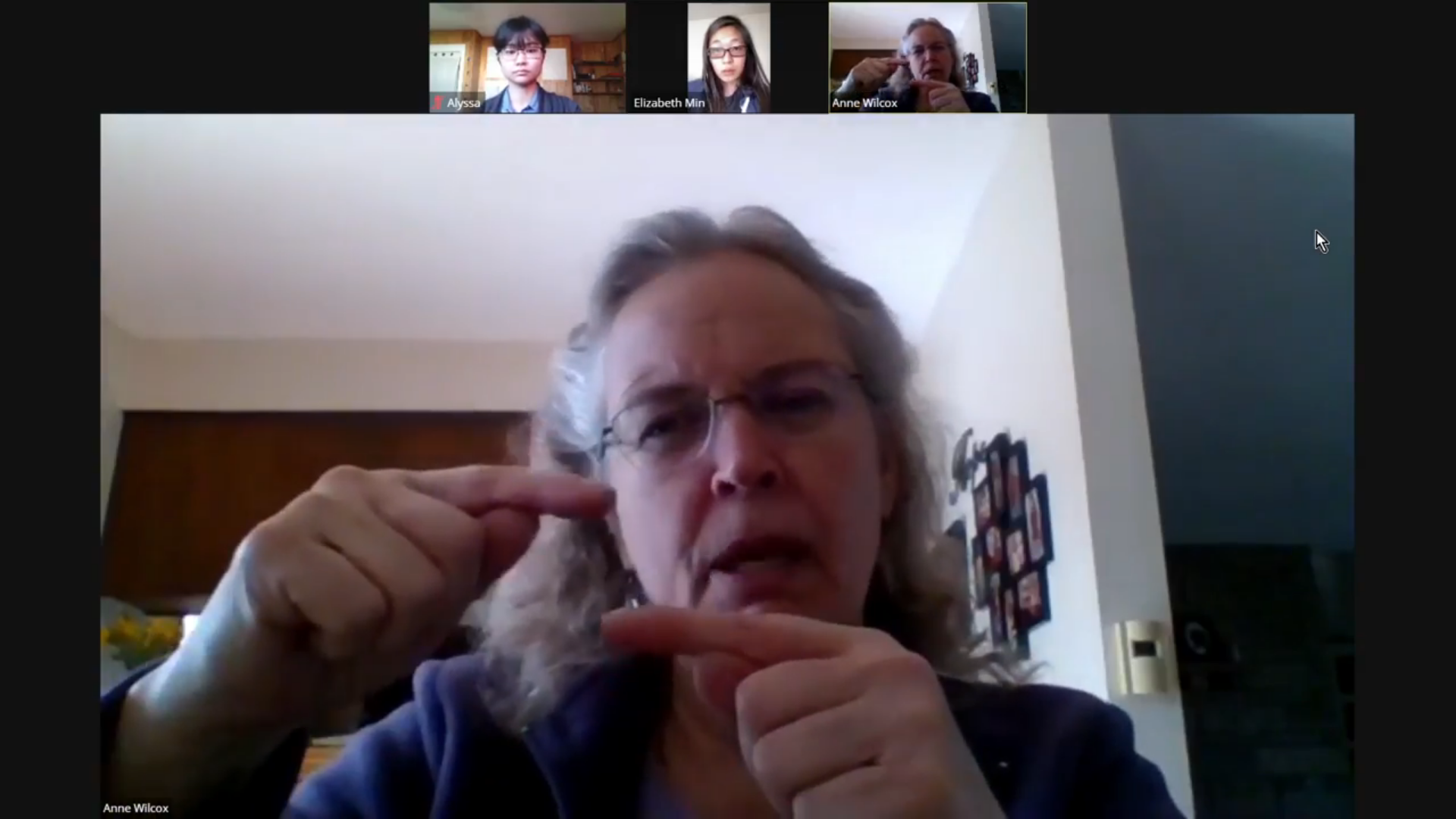
While the developers worked on setting up storing and accessing eBook data, the team lead and I sought out educators to interview. We spoke with a total of four educators in 25-30 minute sessions on their experiences with teaching reading, classroom technology, remote learning, and educational standards.
Key insights from the educator interviews included:
- On school days working from home, many students fail to complete any academic assignments.
- Some teachers use several different programs to assign and track reading exercises (Epic, Lexia, and DIBELS).
- Assignment tracking is time-consuming and diverts resources away from active teaching (“Feels like busywork for teachers”).
- Students often struggle to properly manage their devices (charging) and accounts (passwords).
- There are few apps designed for ELLs (English Language Learners), who face unique challenges as users.
Without the opportunity to interview actual elementary-aged children, I searched for best practices and advice for designing children’s interfaces to learn from the experience of others. Here are some examples of what I found:
- Kids tend to ignore written instructions and will read explanations only if nothing else helps. (Product Design For Kids: A UX Guide To The Child’s Mind)
- Use simple words and rely heavily on symbols, icons, and pictures to communicate meaning. (UX For Kids: A Personal Journey)
- Important links should be displayed as buttons. Kids notice and interact with them more often than text links. (UX For Kids: A Personal Journey)
- Kids aged 5 to 11 tend to rely heavily on the autocorrect function of the search engine due to typos and challenges with spelling. (Designing for Kids: Cognitive Considerations)
- Use voiceover support for young kids, and let the older kids turn off sound if they can read. (Designing Web Interfaces For Kids)
Analysis
The insights gathered from the educator interviews and reviewing best practices for kids’ interfaces allowed me to translate our findings into feature ideas and better define BK Worm’s purpose and value.
Talking to educators about their experiences with technology and teaching during the pandemic brought special attention to the ways BK Worm could be used as a classroom tool.
By handling time-consuming tasks like activity tracking and assessments, BK Worm would be able to help ease the workload for teachers in and outside of class. Employing elements of gamification into the app could vastly improve rates of student engagement at home, and adding features such as text glossing (Annotations for highlighted text, often on translation or meaning) and dictionary images would be incredibly useful for students learning English.
Design
I designed the UI and branding for the MVP version of BK Worm we could reasonably expect to implement by our deadline, as well as some mockups illustrating how BK Worm could be expanded in the future.
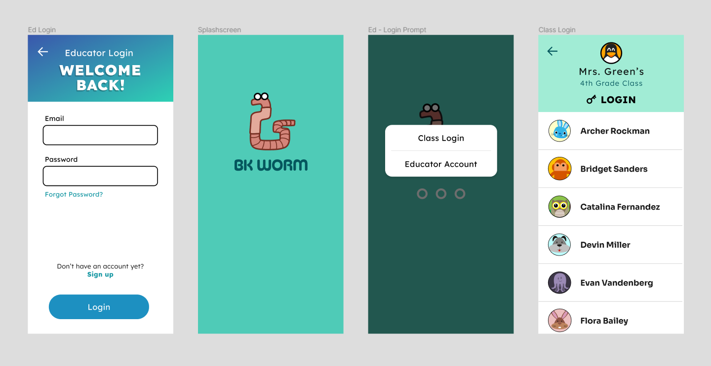
Logo
As the main designer on the project, I was also responsible for cultivating the app’s branding and visual identity. The face of the project became Whit the Worm, a friendly, approachable, and somewhat goofy cartoon earthworm with glasses.
Initial Wireframes
The first round of wireframes covered the parts of the app dedicated to the homepage containing book suggestions and built-in reader features. Informed by the mockups provided by the client as well as interfaces of competing eBook readers such as Kindle and BryteWave, a platform for digital textbooks, I designed an interactive prototype on Figma that demonstrated several core features we wanted to include in the eBook reader.
Due to the product’s shift towards kids’ eBooks, which had to be pitched to the client for approval, the design phase began during sprint one before educator interviews could be completed. It was imperative to design out this section of the app early on for both the pitch and the development team, which was ready to begin basic frontend implementation.
The reader was also one part of the app we could count on remaining relatively stable; it was central to the idea behind our client’s pitch and MVP, whereas the design of the educational tools for teaching literacy skills depended heavily on the results of our research, which had yet to take place at the time.
Final Mockups
After finishing the first iteration of research and analysis, I created another set of mockups to flesh out the educator view of the app. These screens illustrate how teachers create student profiles to add to their class.
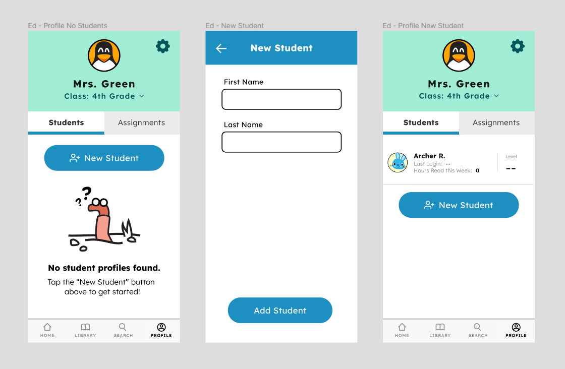
Once created, users can log in as that student to begin reading. Currently, student profiles can only be created and accessed through an educator account, since there is no way for parents to create accounts for their children and link them to a class to be used during school. Ideally, this functionality would be added in the next phase of development.
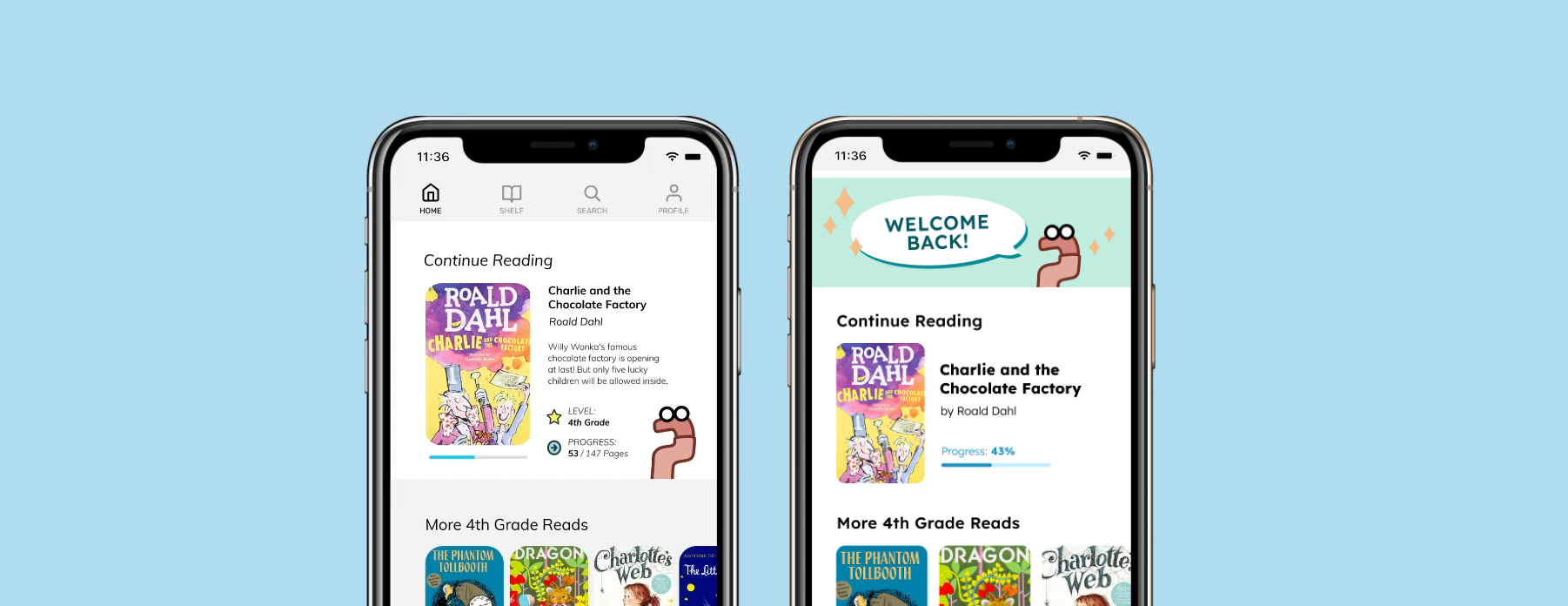
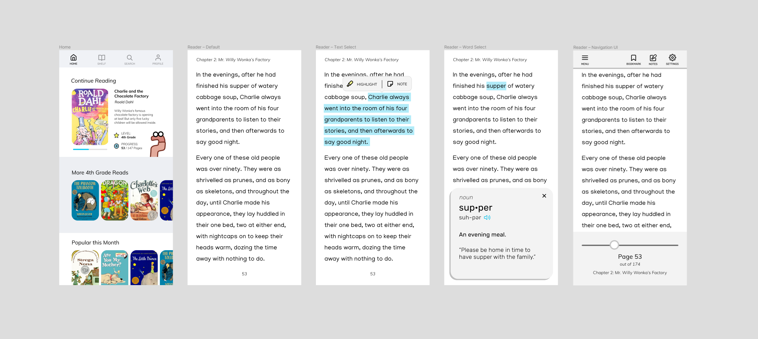
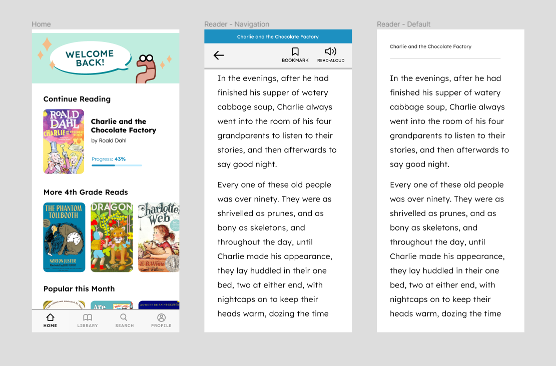
Finally, the redesigned versions of the home screen and reader view are pictured below.
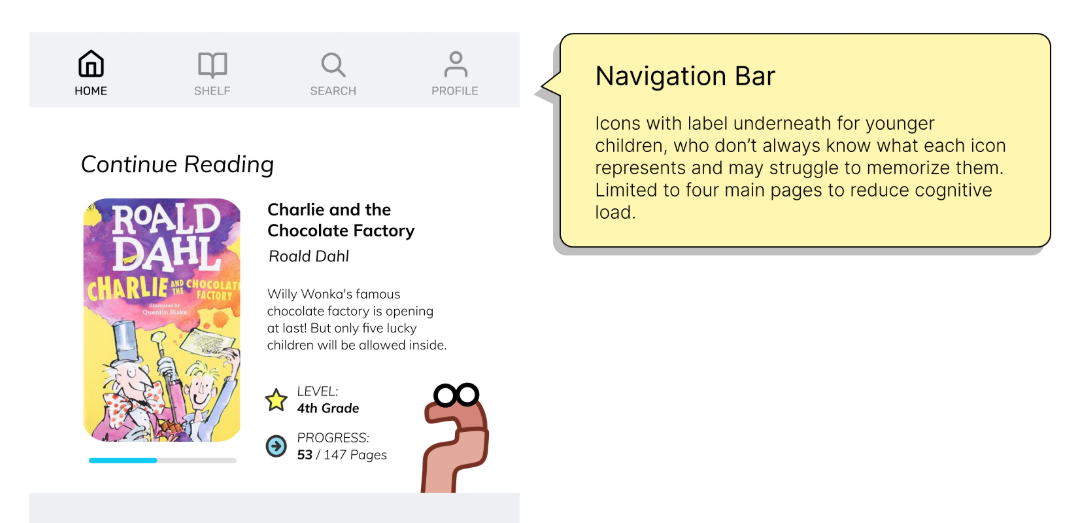
I added a header to break up the monotony of the layout and help give the page a little more warmth and personality. The progress bar on the “Continue Reading” section is more visually intuitive and omits the number of pages to avoid discouraging readers.
On the eBook reader screens, I simplified the navigation view to reflect what we were able to implement and changed the font to Lexend, a typeface intentionally designed for enhanced character recognition and improved reading performance.
Future Preview
In addition to the screens to help guide frontend implementation, I designed a few mockups to embody the team’s vision for what the app could become in the future. The screens below show assignment creation by educators and the student view of reading quizzes and assessments.
Final Thoughts
To date, BK Worm is one of the biggest projects I've designed for and I learned a lot along the way. Here are a few key takeaways:
-
Prioritizing certain features and coming up with balanced versions
of an app is important.
Especially with software, it is likely that development will continue after the initial release of the app. Instead of hoping that everything will make it in the first release, it makes more sense to design with consecutive versions of the app in mind. -
Validate your assumptions before you design something nobody wants
(or needs).
While brainstorming features, conducting research, and going through interviews, it was easy to assume users had certain problems. For instance, early on in the project I was convinced we'd need a way to handle essays or long-answer assignments through the app. However, the teachers we interviewed instead seemed concerned that the lack of handwritten assignments during the pandemic negatively impacted student handwriting and motor skills. -
Exploratory questions can do a lot for user interviews.
There were times when it really paid off to ask questions that weren't strictly or straightforwardly connected to the product. It’s important to engage interviewees and create a open, friendly environment for understanding to happen. It can also lead to unforseen insights in places you’d never think to look.